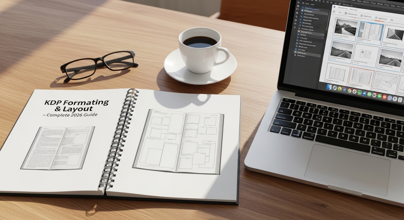
KDP Formatting &
Layout Guide 2026
Getting your KDP book formatting right is the foundation everything else is built on. Wrong margins get your file rejected. Wrong trim size makes your book look amateur on the shelf. Wrong fonts make readers put the book down after two pages. This guide walks through every formatting decision — trim size, margins, gutters, bleed, fonts, line spacing, and interior setup — plus a free Formatter Checker tool that tells you exactly what settings to use for your specific book.
📋 Table of Contents
- Why Formatting Decides Print Quality
- 🛠️ Format Checker Tool
- KDP Trim Sizes Explained
- Margins & Gutter Settings
- Bleed — When & How Much
- Fonts & Typography
- Line Spacing & Paragraph Setup
- Images in Print Interiors
- File Export — PDF Best Practices
- KDP Rejection Reasons & Fixes
- Formatting Software Options
- FAQs
Why Formatting Is the Foundation of a Professional KDP Book
Most new KDP authors think of formatting as a technical checkbox — something you do quickly before uploading. That thinking is exactly why so many self-published books look unprofessional on Amazon. Formatting is not just about passing KDP's automated file review. It determines how your book physically feels in a reader's hands, how easy it is to read for 300 pages, and whether a bookstore buyer would pick it up or set it back down.
The cascade effect of poor formatting is real. Too-small margins make text feel cramped and anxious. Too-large margins waste pages, inflate your print cost, and push your minimum price higher — which directly affects your royalty. Wrong trim size compared to genre norms signals to a browsing reader that your book is self-published in a way that holds it back. Font choices that work on screen often fail in print, creating fatigue after a few chapters.
Done correctly, formatting is invisible — the reader never notices it because it just works. That invisibility is the goal. This guide tells you exactly what "correctly" looks like for KDP print-on-demand in 2026.
Format Once in a Template — Use It for Every Book
The most efficient approach to KDP formatting is to build one master template in your word processor or design software that has all your settings locked in — trim size, margins, fonts, styles, headers, and footers. Every new book starts from this template. You spend the formatting time once, then apply it indefinitely. This also ensures consistency across a series, which builds brand recognition for your author name.
🛠️ KDP Format Settings Checker
Enter your book details below. The tool generates your complete formatting specification — exact trim size, minimum margins, gutter width, recommended fonts, line spacing, and a pre-flight checklist before you upload to KDP.
KDP Trim Sizes — Choosing the Right Dimensions for Your Book
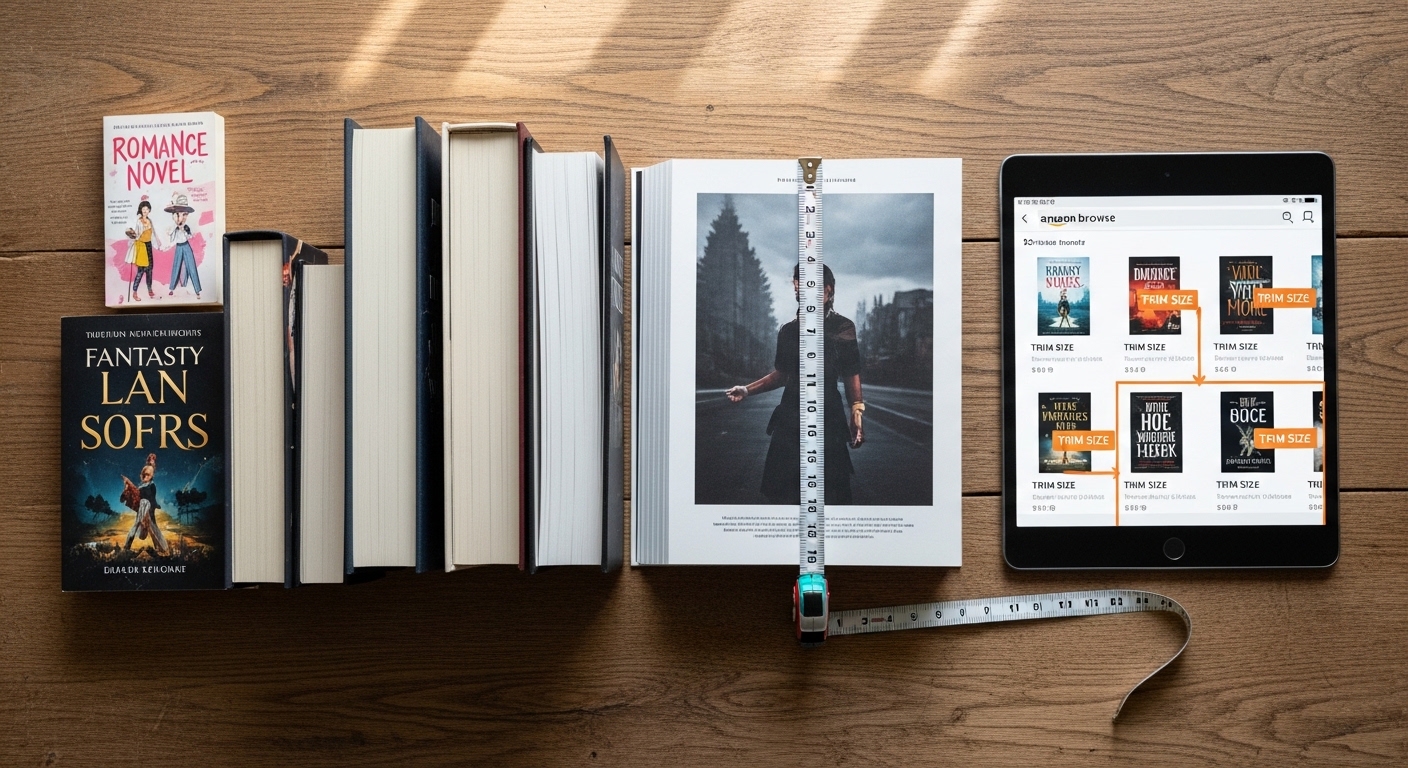
Trim size is the finished physical dimension of your printed book. KDP offers a wide range of available trim sizes, but the genre conventions around which sizes look appropriate are narrow. Choosing a trim size outside the norm for your genre does not cause a KDP rejection — it just makes your book look slightly off to genre-familiar readers, in the same way a hardboiled detective novel with a pastel cover would.
Most Popular KDP Trim Sizes by Genre
| Trim Size | Best For | Industry Name | Popularity |
|---|---|---|---|
| 5" × 8" | Mass-market fiction — romance, thrillers, fantasy, sci-fi | Mass Market Paperback | ⭐⭐⭐⭐⭐ Most popular fiction |
| 5.5" × 8.5" | Fiction, memoir, general non-fiction | Trade Paperback (small) | ⭐⭐⭐⭐ Very common |
| 6" × 9" | Non-fiction, business, self-help, memoir, textbooks | Trade Paperback (standard) | ⭐⭐⭐⭐⭐ Most popular non-fiction |
| 7" × 10" | Textbooks, workbooks, academic, large format non-fiction | Large Format Trade | ⭐⭐⭐ Niche |
| 8" × 10" | Children's illustrated, cookbooks, activity books | Children's / Illustrated | ⭐⭐⭐⭐ Common for illustrated |
| 8.5" × 8.5" | Children's picture books (square format) | Square Children's | ⭐⭐⭐ Children's specialty |
| 8.5" × 11" | Workbooks, journals, coloring books, large notebooks | US Letter / Full Sheet | ⭐⭐⭐⭐ Low-content standard |
| 6" × 9" (Hardcover) | Non-fiction, memoir, premium fiction editions | Standard Hardcover | ⭐⭐⭐⭐⭐ Most popular hardcover |
Check Amazon's Bestseller List for Your Genre's Trim Size
Before locking your trim size, search Amazon for the top 10 bestselling paperbacks in your genre and look at each book's dimensions listed on the product page. This tells you instantly what readers in your genre are used to holding and what looks normal on the shelf next to your competition. Matching the genre standard is not copying — it is meeting an established reader expectation.
Trim Size and Page Count Relationship
Your trim size directly affects how many pages your manuscript becomes in print. A 70,000-word novel formatted at 5×8 inches might be 290 pages. The same manuscript at 6×9 inches might be 230 pages. Fewer pages mean a lower print cost per copy and a smaller minimum price — which means more room for royalty margin and competitive pricing. This is why non-fiction authors who write shorter books often choose 6×9: it keeps page counts reasonable without making the book look too thin on the shelf.
KDP Margins & Gutter Settings — The Most Important Numbers
Margins are the white space between your text and the edge of the page. The gutter is the inside margin — the extra space closest to the spine where the pages are bound together. Getting margins wrong is the most common cause of KDP file rejection, and getting the gutter wrong is the most common cause of professionally formatted books that look amateur in hand — because the text runs too close to the binding and becomes hard to read.
KDP Minimum Outside Margin Requirements
KDP requires a minimum outside margin of 0.25 inches on all exterior edges (top, bottom, and outside/fore-edge). This is a hard minimum — anything below this will be rejected. In practice, 0.25 inches looks very tight and somewhat cheap. Most professional book designers use 0.5–0.75 inches on the outside margin for body text books, with additional breathing room for headers and footers in that space.
Gutter (Inside Margin) Requirements by Page Count
| Page Count | KDP Minimum Gutter | Recommended Gutter | Notes |
|---|---|---|---|
| 24 – 150 pages | 0.375" | 0.5" | Thin books flex easily — minimum is often fine |
| 151 – 300 pages | 0.5" | 0.625" | Standard novel length — add buffer for comfort |
| 301 – 500 pages | 0.625" | 0.75" | Spine gets thicker — more gutter needed to read comfortably |
| 501 – 700 pages | 0.75" | 0.875" | Thick books — spine curvature pulls text toward binding |
| 701 – 828 pages | 0.875" | 1.0" | Maximum length KDP allows — gutter must be generous |
Mirror Margins — Essential for Print Books
Print books use mirror margins, meaning the inside (gutter) margin is larger on the left side of right-hand pages and the right side of left-hand pages — always toward the spine. Your word processor or design software must have mirror margins enabled, not equal margins on all sides. Equal margins are for screen documents. Mirror margins are for books. If you upload a file with equal margins, the binding side will have insufficient space even if your margin numbers look correct.
Recommended Full Margin Setup for Common Trim Sizes
| Trim Size | Top | Bottom | Outside | Gutter (≤300 pages) | Gutter (301–500 pages) |
|---|---|---|---|---|---|
| 5" × 8" | 0.75" | 0.75" | 0.5" | 0.625" | 0.75" |
| 5.5" × 8.5" | 0.875" | 0.875" | 0.5" | 0.625" | 0.75" |
| 6" × 9" | 1.0" | 1.0" | 0.625" | 0.75" | 0.875" |
| 7" × 10" | 1.0" | 1.0" | 0.625" | 0.75" | 0.875" |
| 8.5" × 11" | 1.0" | 1.0" | 0.75" | 0.875" | 1.0" |
Digital Calipers — Measure Your Proof Copy with Precision
When your proof arrives, use digital calipers to measure your actual printed margins, spine width, and trim accuracy. The difference between what your design file shows and what the physical copy produces can vary slightly — calipers let you catch these gaps before approving a wide release.
Bleed in KDP Books — When You Need It and How Much
Bleed refers to content that extends beyond the finished trim edge of the page before cutting. When KDP prints and cuts your book, the cutting process is not perfectly precise — it can vary by a small amount. Bleed ensures that if the cut falls slightly outside the intended line, there is no thin white strip left at the edge of the page where your image or background should have been.
When Bleed Is Required
- Images that touch the page edge: If any photo, illustration, or graphic element extends to the edge of the page, you need bleed.
- Colored or patterned backgrounds on pages: If your page background is anything other than white or cream, it needs to bleed past the trim edge.
- Full-page spreads: Any two-page layout where the design runs across both pages edge-to-edge requires bleed.
- Chapter header artwork: If your chapter opening pages have a decorative border or colored band at the top that reaches the page edge, bleed is required.
When Bleed Is NOT Required
- Text-only interiors: Standard novel, memoir, or non-fiction text with no graphics touching page edges — no bleed needed.
- Small inline illustrations: Images within the text block that have white space around them on all sides — no bleed needed.
- Ruled lines and tables: Interior tables and bordered content that does not touch page edges — no bleed needed.
KDP Bleed Specification
KDP requires 0.125 inches (3.175mm) of bleed on all sides that have content extending to the trim edge. Your document size must be set to the trim size plus bleed on each bleed side. For a 6×9 book with bleed on all four sides, your document size would be 6.25" × 9.25". Your content must extend into the bleed zone, but any critical content (text, logos, important artwork) must stay at least 0.125" inside the trim edge — this inner safe zone prevents important content from being cut off.
Use Our Free Bleed Calculator
KDP's bleed requirements vary slightly depending on trim size and paper type. Our free Bleed Calculator gives you the exact document dimensions for any trim size with or without bleed — no manual math required. Enter your trim size and it outputs your document setup numbers.
KDP Interior Fonts & Typography — What Works in Print
Font choice for a KDP interior is a fundamentally different decision than font choice for a website, a presentation, or a logo. Screen fonts and display fonts are designed to look attractive at larger sizes or on backlit displays. Book body fonts are designed for a very specific task: to be read for hours at 11 or 12 points on white or cream paper under ambient light, with minimal fatigue. Most of what looks good in Canva or on your website is genuinely wrong for book interiors.
Body Text Font Recommendations
Font Sizes for Different Book Elements
| Element | Recommended Size | Style Notes |
|---|---|---|
| Body text (fiction) | 11 – 12pt | Serif font, regular weight, justified alignment |
| Body text (non-fiction) | 11 – 12pt | Serif font, regular weight, justified or left-aligned |
| Chapter headings | 18 – 24pt | Same font heavier weight, or contrasting font — all caps or title case |
| Section headings (H2) | 14 – 16pt | Bold, same family as chapter heads or body |
| Subheadings (H3) | 11 – 13pt | Bold or italic, same font family as body |
| Headers / Footers | 8 – 9pt | Small caps or regular, author name / book title / page number |
| Footnotes / Endnotes | 8.5 – 9.5pt | Same body font at reduced size |
| Drop caps (chapter openers) | 2–3 lines tall | Optional stylistic element — first letter of chapter enlarged |
Avoid These Fonts for KDP Book Interiors
Arial, Helvetica, Calibri, and other sans-serif fonts are not designed for extended reading at small sizes on print paper — they cause fatigue after longer reading sessions. Decorative or script fonts (Brush Script, Comic Sans, handwriting fonts) are never appropriate for body text. Century Gothic, Trebuchet, and similar display fonts were designed for screens, not paper. The rule is simple: if you are not certain a font is designed for print book body text, default to Garamond or Georgia.
Line Spacing, Paragraph Setup & Text Alignment
Line spacing — also called leading in typography — is the vertical distance between lines of text. It is one of the most directly felt aspects of readability, even though most readers cannot consciously name what makes a page feel open or cramped. Too tight, and the book feels dense and difficult. Too loose, and the page count balloons and the text feels airy and unserious. The right setting depends on your font, font size, and the genre of book you are publishing.
Line Spacing Recommendations
| Book Type | Recommended Line Spacing | In Word (Multiple) | Effect |
|---|---|---|---|
| Literary / General Fiction | Single to 1.15 | 1.0–1.15 | Clean, tight — traditional book feel |
| Genre Fiction (thriller, romance) | 1.15 – 1.2 | 1.15 | Slightly open — fast-paced reading rhythm |
| Non-Fiction / Business | 1.2 – 1.3 | 1.2–1.3 | Open and readable — good for learning content |
| Children's Books | 1.3 – 1.5 | 1.3–1.5 | Open and accessible for developing readers |
| Workbooks / Textbooks | 1.2 – 1.4 | 1.2–1.4 | Space for reader notes if applicable |
| Poetry Collections | Varies | Varies by poem | Specific to poem structure — no single rule |
Paragraph Indentation vs Paragraph Spacing
Traditional printed books use first-line indentation (typically 0.25–0.35 inches) to indicate new paragraphs, with no extra spacing between paragraphs. This is the convention in virtually all published fiction. Non-fiction commonly uses block paragraphs — no indentation but 6–8pt of space between paragraphs. Use one system or the other — never both simultaneously, as that creates the cluttered look that marks an amateur interior.
Never Use Two Spaces After a Period in Print Books
The two-spaces-after-period habit is a typewriter convention that does not belong in typeset books. Modern book typography uses a single space after all punctuation. If your manuscript has double spaces throughout (common when writing in Word), use Find & Replace to swap all double spaces for single spaces before formatting — otherwise your justified text will have inconsistent word spacing throughout the book.
Images in KDP Print Interiors — Resolution, Color & Placement
Images in print are fundamentally different from images on screen. A photo that looks sharp at 72 DPI on a website will be noticeably blurry in a KDP printed book. Print requires a minimum of 300 DPI at the intended print size — meaning a photo you want printed at 4 inches wide must have at least 1200 pixels of horizontal resolution (4 × 300 = 1200px). This catches many first-time KDP authors off guard during their first proof review.
KDP Interior Image Requirements
| Image Type | Minimum Resolution | Color Mode | Notes |
|---|---|---|---|
| B&W interior photo | 300 DPI | Grayscale | Convert RGB to grayscale before embedding — prevents unexpected rendering |
| B&W interior illustration | 300–600 DPI | Grayscale or 1-bit | Line art benefits from higher DPI for sharp edges |
| Color interior photo | 300 DPI | RGB or CMYK | Color printing available — significantly higher cost per page |
| Full-page image (with bleed) | 300 DPI at full size + bleed | Match interior type | Document must be set up with bleed when images touch edges |
| Charts / Diagrams (text in image) | 300–400 DPI | Grayscale for B&W | Ensure text in images is large enough to read at final print size |
Color Photos in B&W Interiors Print as Gray — Check Your Proofs
If you choose black and white interior printing (which is standard and much cheaper), any color photos in your manuscript will be automatically converted to grayscale by KDP's printing process. The result is often unexpected — photos with high color contrast but low brightness contrast look muddy or flat when converted. Always preview your images in grayscale before submitting, and adjust contrast/brightness in grayscale mode if needed.
File Export for KDP — How to Create the Right PDF
The file format you upload to KDP matters more than most authors realize. KDP accepts DOCX, PDF, and several other formats — but PDF is the only format that guarantees your formatting, fonts, and layout arrive exactly as you designed them. When KDP processes a Word DOCX file, it runs its own conversion that can subtly (or dramatically) reflow text, change font rendering, alter spacing, and shift page breaks. A correctly exported PDF eliminates all of these variables.
PDF Export Settings for KDP
- Standard or PDF/X-1a: PDF/X-1a is the professional print standard — it embeds all fonts and flattens transparency. Standard PDF with embedded fonts also works well.
- Embed all fonts: This is critical. If your PDF references fonts without embedding them, KDP's system may substitute a different font, completely changing your interior's appearance.
- No security restrictions: Do not password-protect or add DRM to your PDF before uploading to KDP — this causes upload failures.
- Correct document size: Your PDF page size must exactly match your intended trim size (plus bleed if applicable). A 6×9 book formatted in an 8.5×11 document is a common and immediately obvious error.
- Flatten transparency: If your design software uses transparent layers or blending effects, flatten them before export to prevent unexpected print rendering.
- No crop marks in PDF: Do not add printer's crop marks to your interior PDF — these are used for commercial offset printing but cause errors in KDP's print-on-demand system.
📐 Use Our Free KDP Paperback Formatter
Our free Paperback Formatter generates a properly formatted Word document template with your exact trim size, mirror margins, and style settings pre-configured — so you can write directly in a print-ready format from page one.
KDP File Rejection Reasons — And How to Fix Each One
KDP's automated review system checks uploaded files against a set of technical requirements before allowing a book to go live. Understanding the most common rejection reasons saves you days of upload-review-fix cycles and gets your book publishing faster.
| Rejection Reason | Why It Happens | Fix |
|---|---|---|
| Margins too small | Outside or gutter margin below KDP minimums | Check our margin table — increase gutter especially |
| Fonts not embedded | PDF exported without embedding fonts | Re-export PDF with "embed all fonts" option enabled |
| Document size mismatch | Page size in file does not match selected trim size | Match PDF dimensions exactly to your trim size choice |
| Low resolution images | Images below 300 DPI at print size | Replace with higher resolution originals or reduce print size |
| Bleed required / missing | Content extends to page edge but no bleed was set up | Add 0.125" bleed to document and extend art into bleed zone |
| Blank pages at wrong location | Section breaks or page layout creating unexpected blanks | Check each chapter start in print preview before export |
| Cover included in interior | Interior file accidentally includes cover page | Remove cover from interior file — upload separately |
| Copyright / third-party content | Quoted text, song lyrics, or images without rights | Remove or replace with properly licensed material |
| Page count too low | Book below KDP's 24-page minimum | Expand content or increase font/spacing to minimum page count |
| Transparency not flattened | Design software layers with blend modes in PDF | Flatten all layers before PDF export in InDesign/Affinity |
Always Order a Physical Proof Copy Before Wide Release
KDP's online print previewer catches many issues, but it does not replace a physical proof. Order one proof copy to your address before setting your book to "live" on Amazon. Check the gutter clearance — is text obscured near the spine? Check image quality in print. Check that headers and footers are positioned correctly. The $5–$10 cost of a proof copy is insurance against a product page covered in one-star reviews about printing quality.
KDP Formatting Software — Which Tool Is Right for You
You have real choices in how you format your KDP interior, and the right answer depends on how many books you publish, how much design control you want, and your existing software skills. Here is an objective breakdown of the most common options used by active KDP publishers.
| Software | Best For | Cost | Learning Curve | KDP Suitability |
|---|---|---|---|---|
| Microsoft Word | Text-heavy books, beginners, quick turnaround | Subscription (~$7/mo) | Low | Good — use PDF export |
| Google Docs | Simple books, writers already in the Google ecosystem | Free | Very Low | Acceptable — limited layout control |
| Vellum (Mac only) | Fiction authors, series publishers, multiple formats | ~$200 one-time | Low | Excellent — beautiful output |
| Atticus | Cross-platform authors wanting Vellum-style output | ~$147 one-time | Low-Medium | Very Good |
| Adobe InDesign | Professional designers, complex layouts, illustrated books | Subscription (~$22/mo) | High | Professional-grade output |
| Affinity Publisher 2 | InDesign alternative — professional without subscription | ~$70 one-time | Medium-High | Excellent for complex layouts |
| Scrivener | Writers who draft and format in the same tool | ~$59 one-time | Medium | Good — compile settings take setup time |
12" Metal Ruler — For Measuring Physical Proofs
When your proof copy arrives, use a precise metal ruler to measure actual margins, spine width, and trim accuracy. A 12" metal ruler with both inch and millimeter markings is the right tool for checking your physical proof against your design specs before approving your book for full distribution.
Author Tools for Better KDP Formatting
The right physical tools at your desk make the formatting and review process faster and more accurate.
Related KDP Guides & Tools
KDP Formatting & Layout — Common Questions
The questions KDP authors most often ask about interior formatting, margins, fonts, and file setup.
Format Your KDP Book the Right Way — Free Tools
Use our free Paperback Formatter to generate a properly configured Word template with your exact trim size, mirror margins, and style settings pre-built. No guessing, no manual setup.